Boccaccia
Visual Identity
Brand Identity
Typography
Typeface Design
Iconography
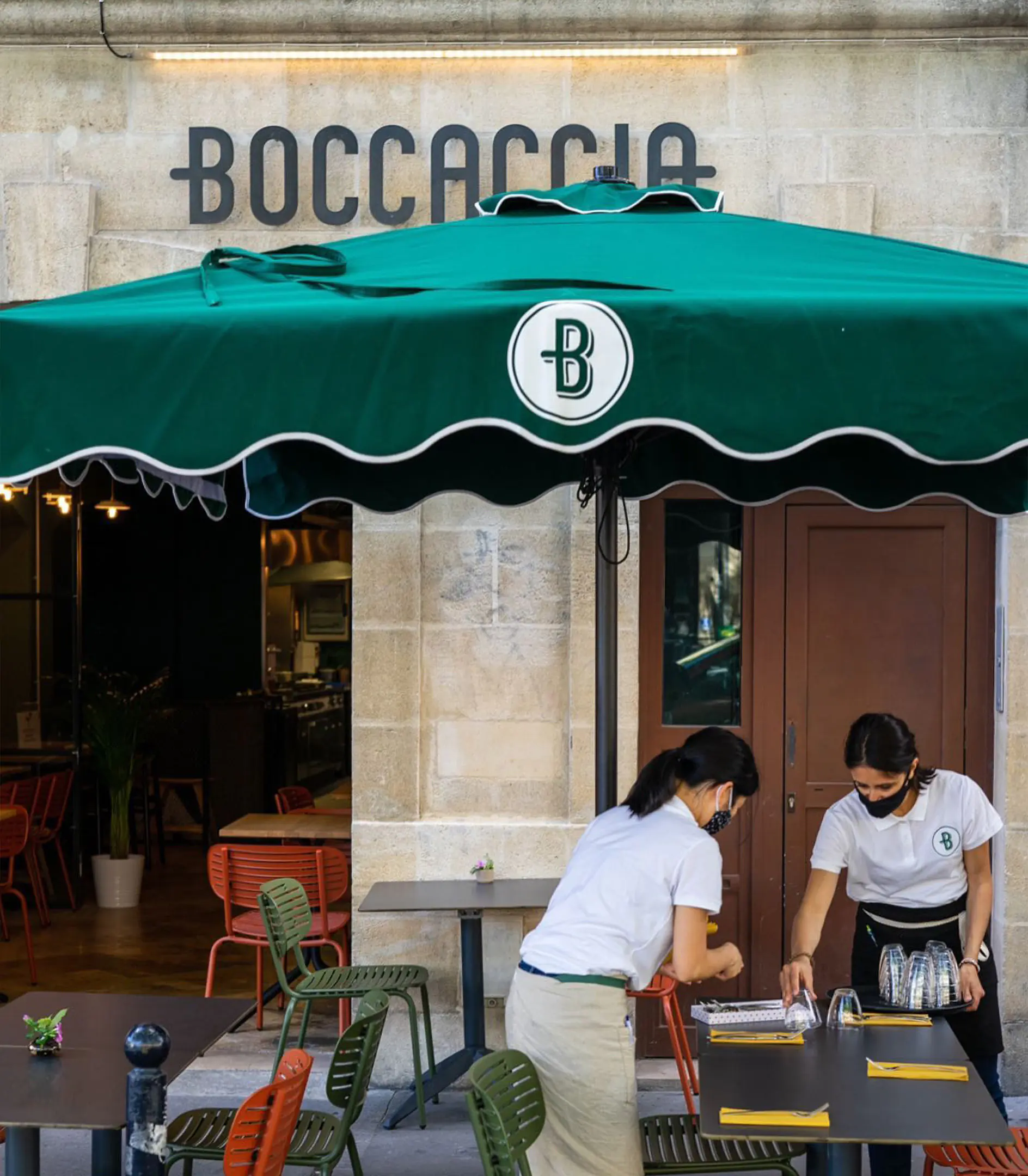
Signage
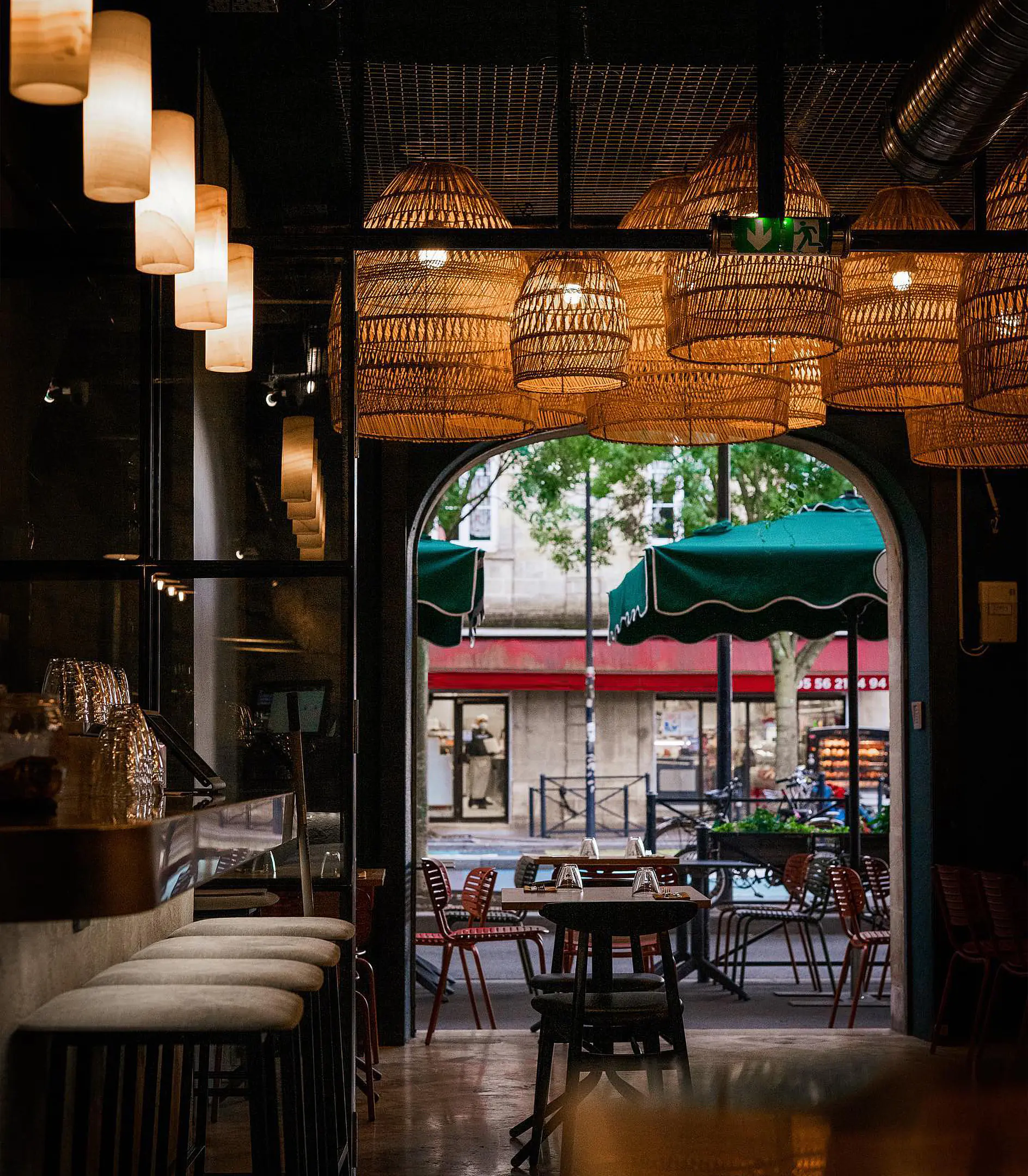
Interior Design
Art Direction
PROBLEM
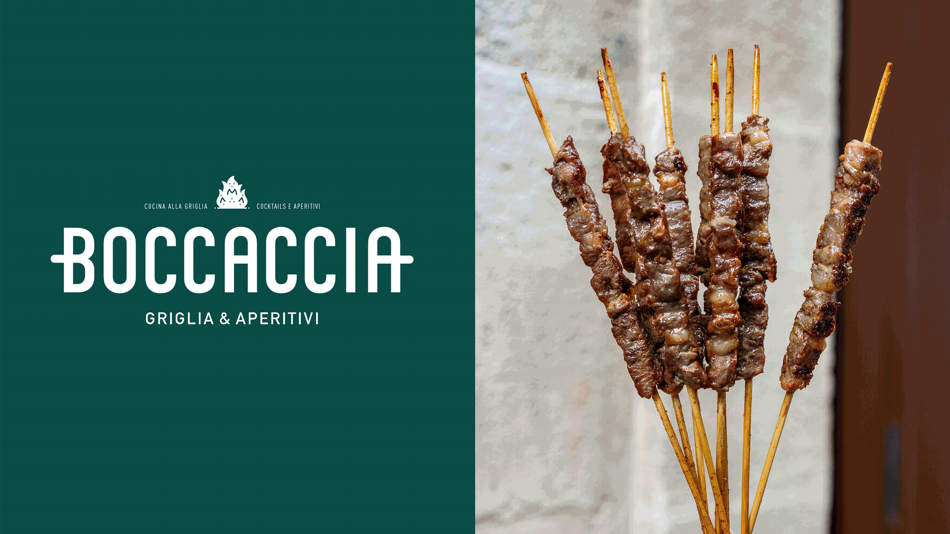
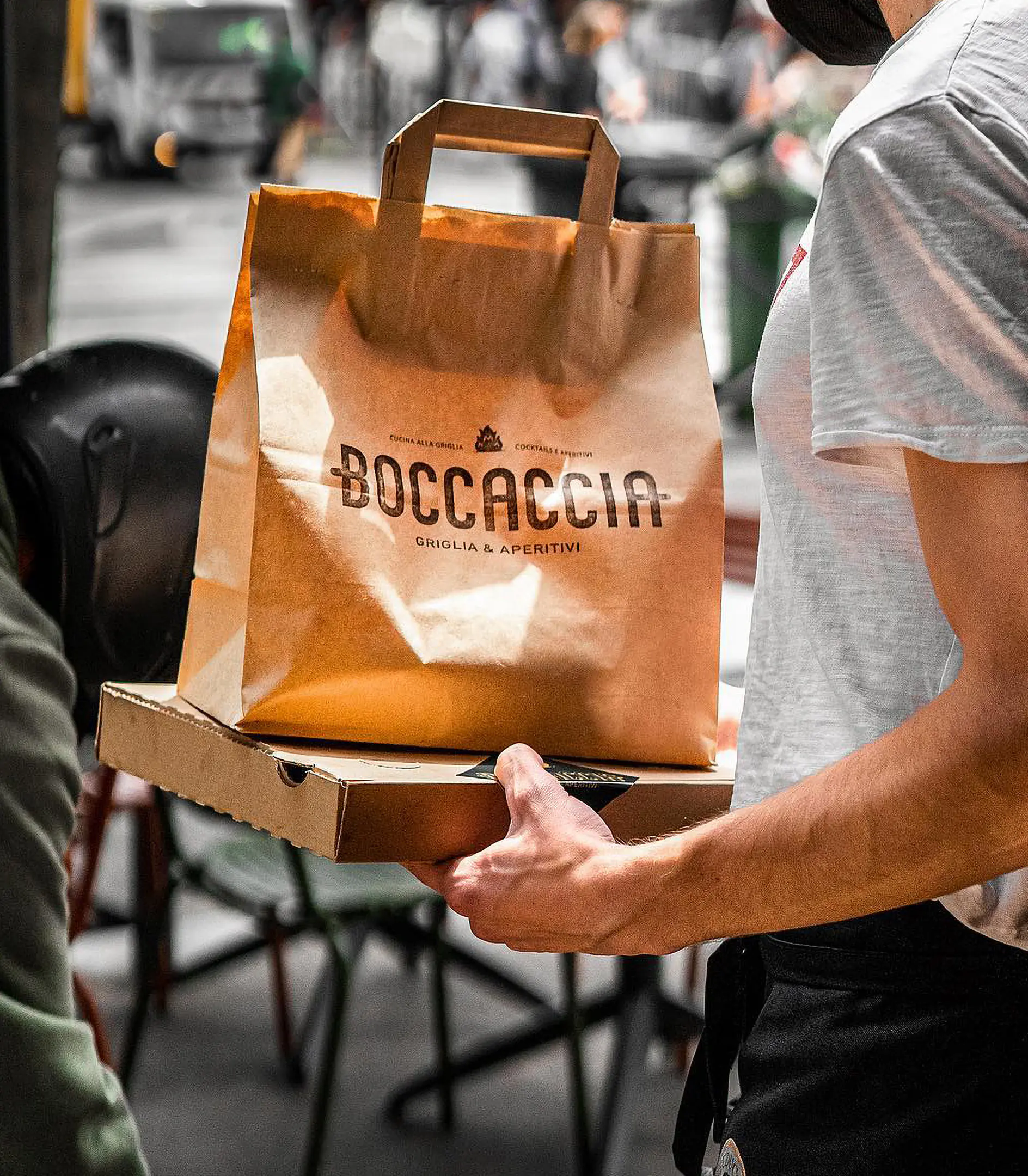
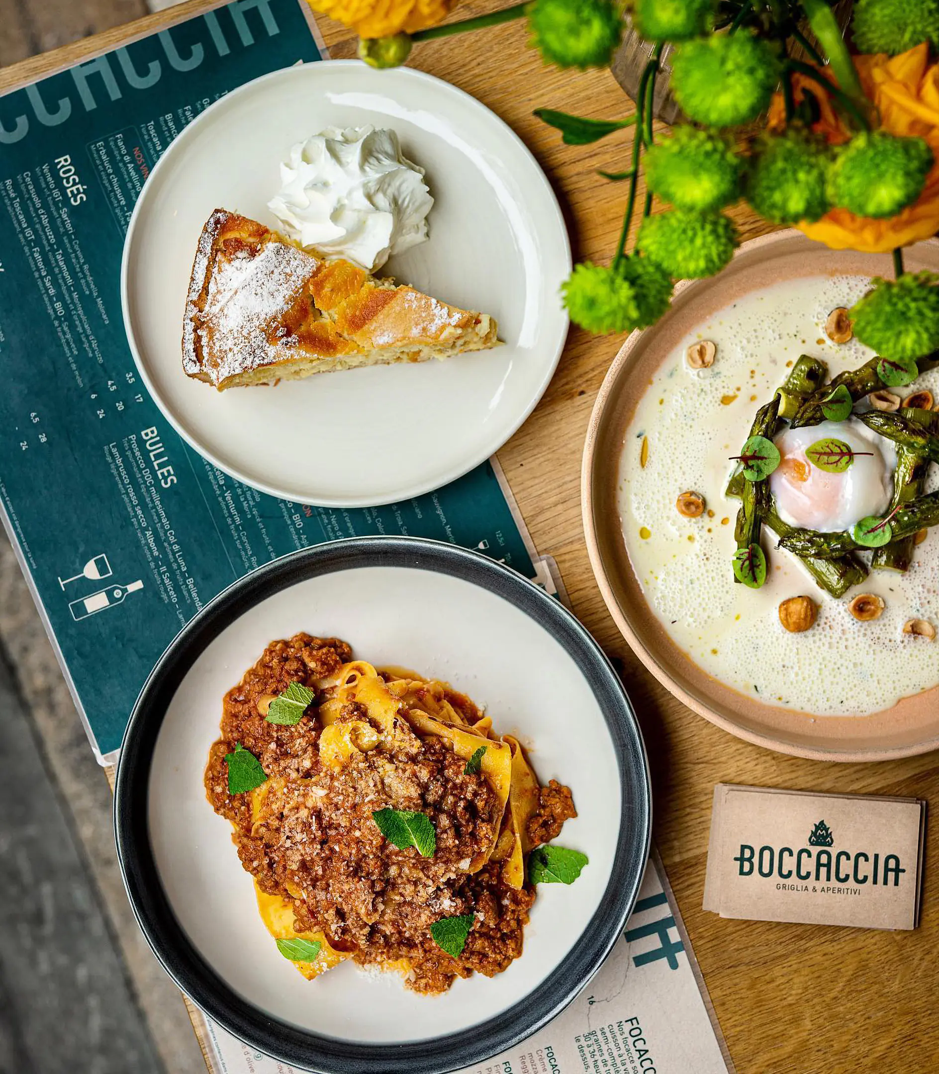
BOCCACCIA is a cozy, highly-rated Italian restaurant located in the heart of Bordeaux, focusing on serving an authentic Italian experience by offering a menu inspired by the longstanding tradition of Italian street food. Working closely with the restaurant owners I have been commissioned with the creation of an identity that evokes the authenticity of the experience as well as the sense of heritage that Italian food carries across
SOLUTION
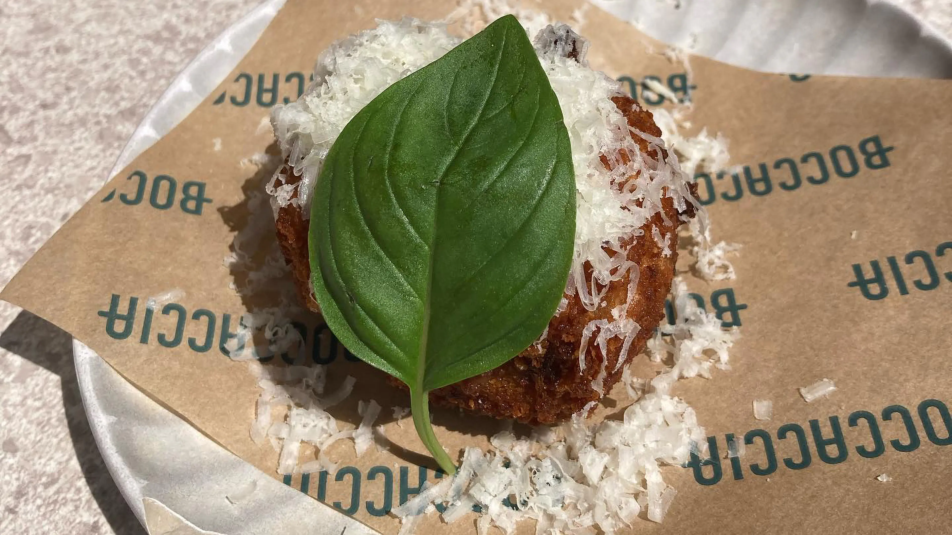
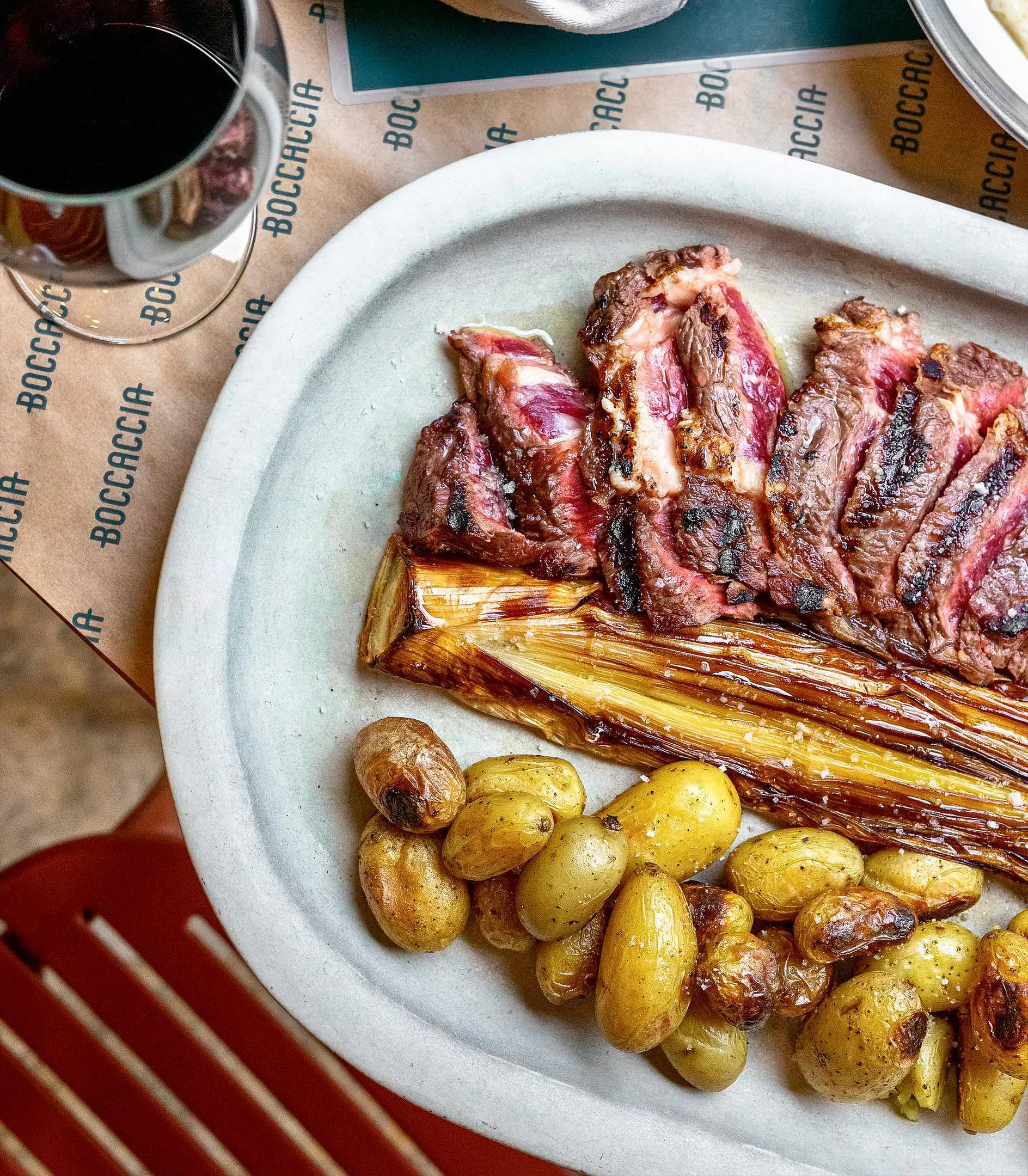
The foundation of the identity has been built around two main pillars of the restaurant's offering. The usage of high-quality cooking equipment, such as the charcoal oven that they use to prepare their signature dishes to a crisp. But also the choice of one of the most iconic recipes in the italian street food tradition, to represent what the restaurant and its menu stands for. A charcoaled lamb skewer called 'Arrosticino'
CREATIVE
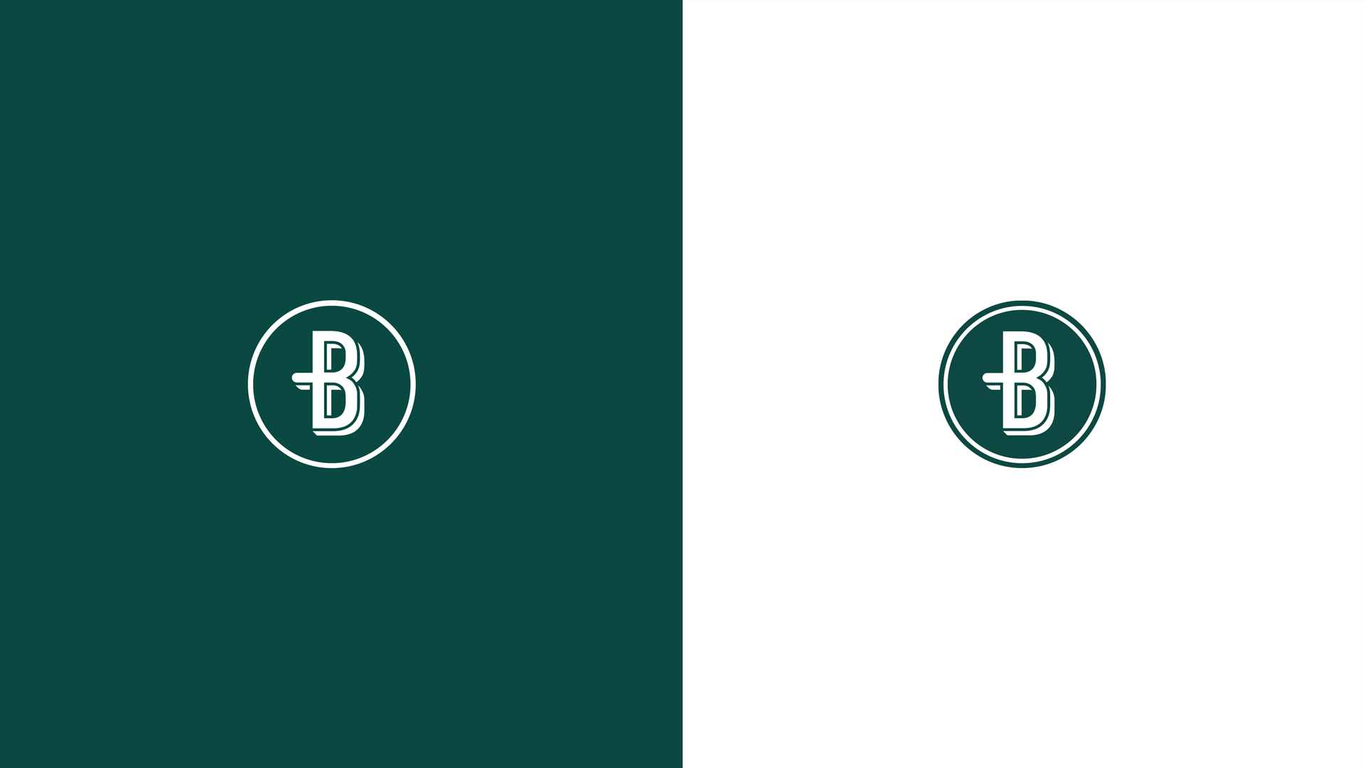
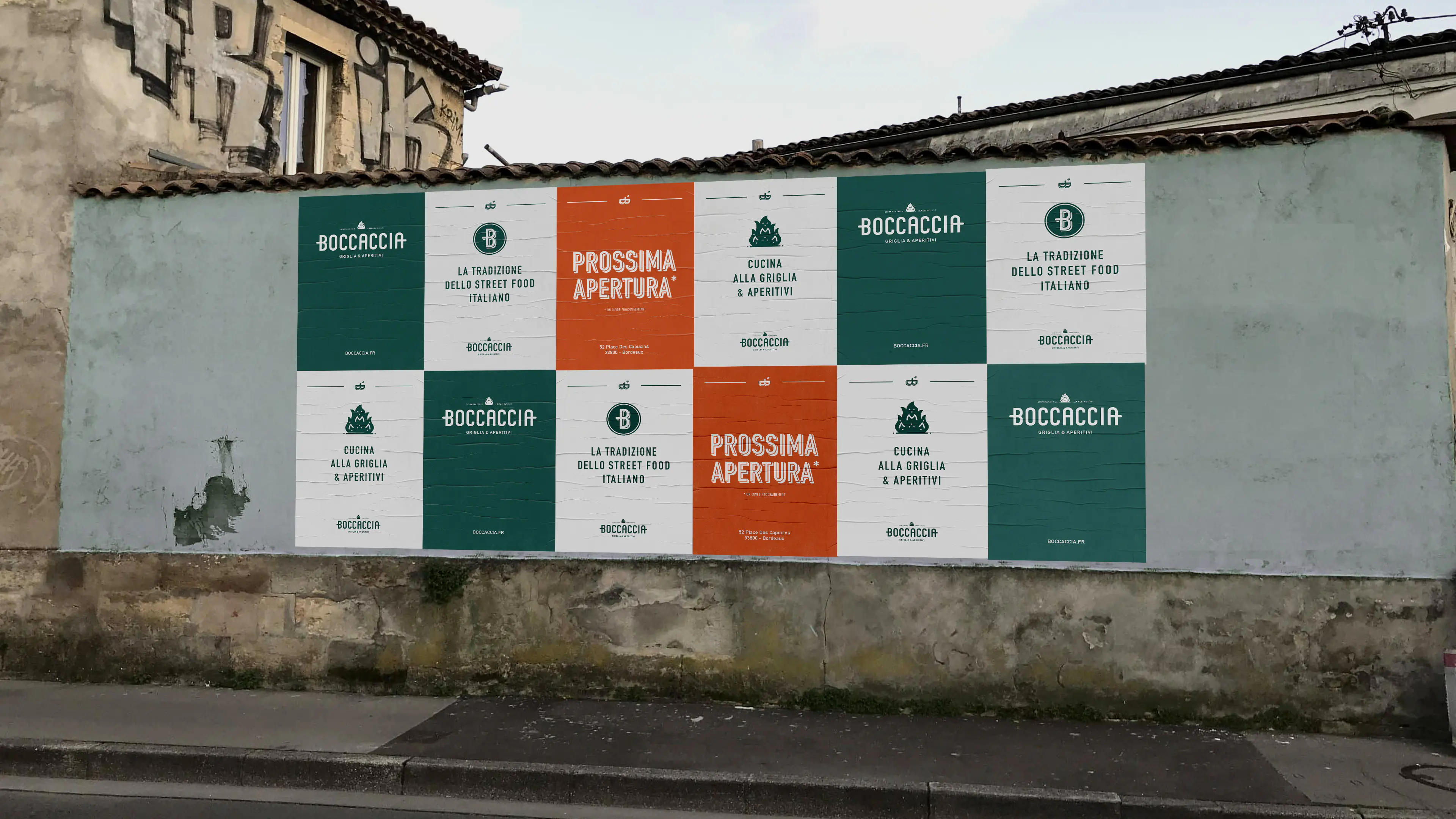
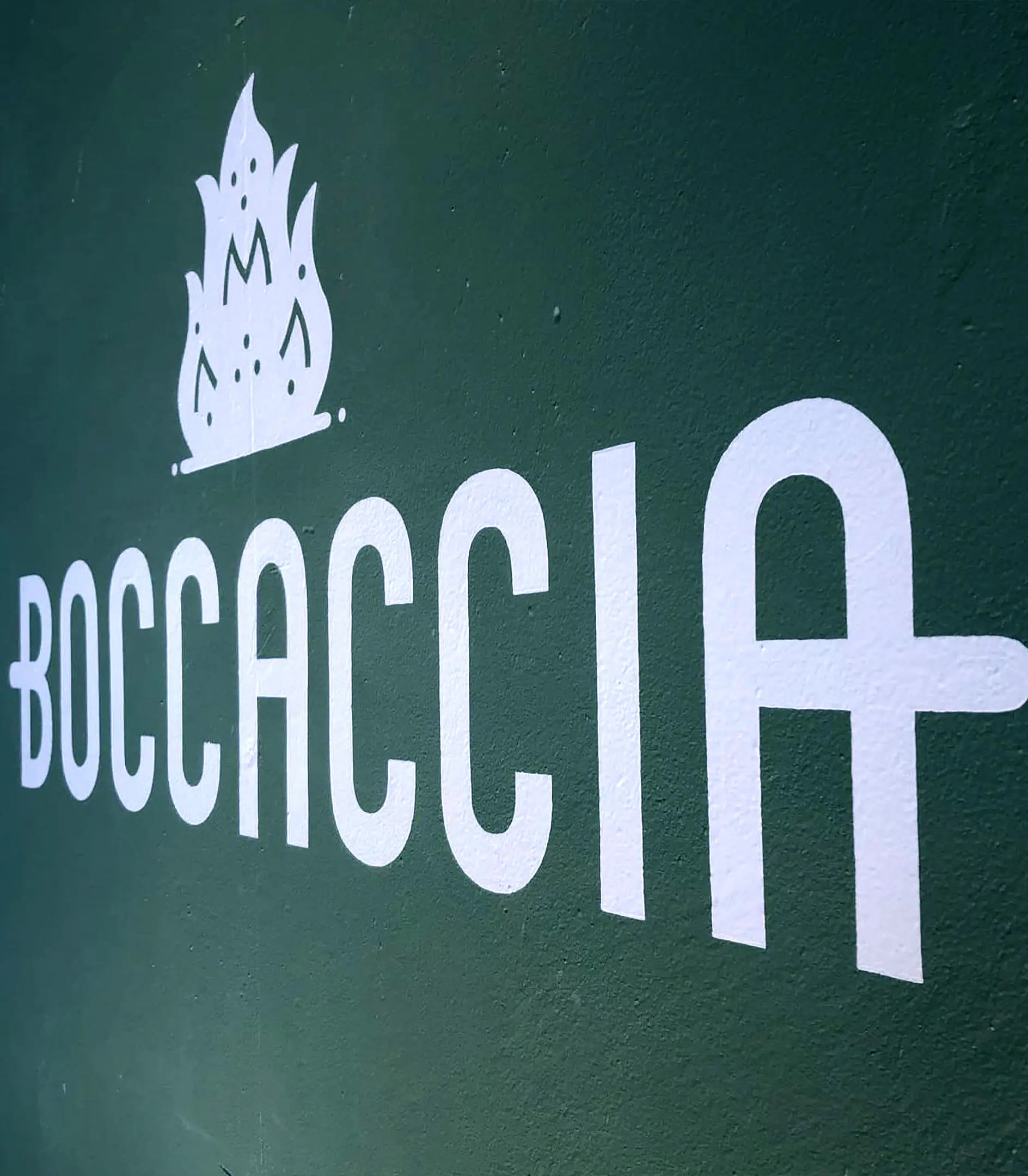
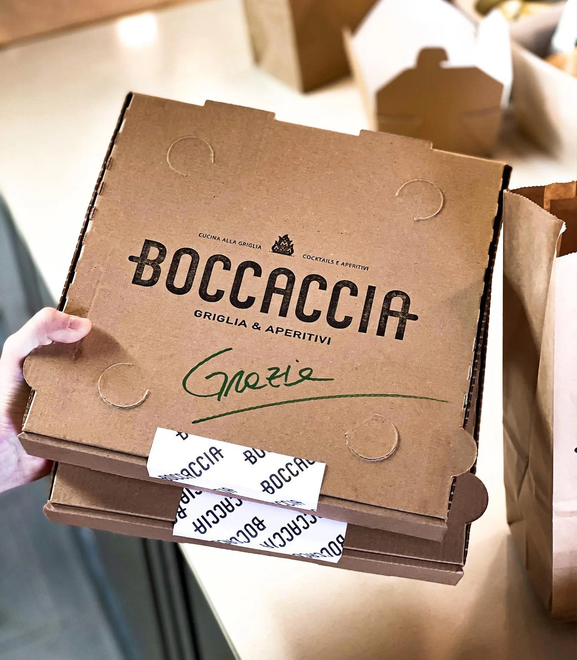
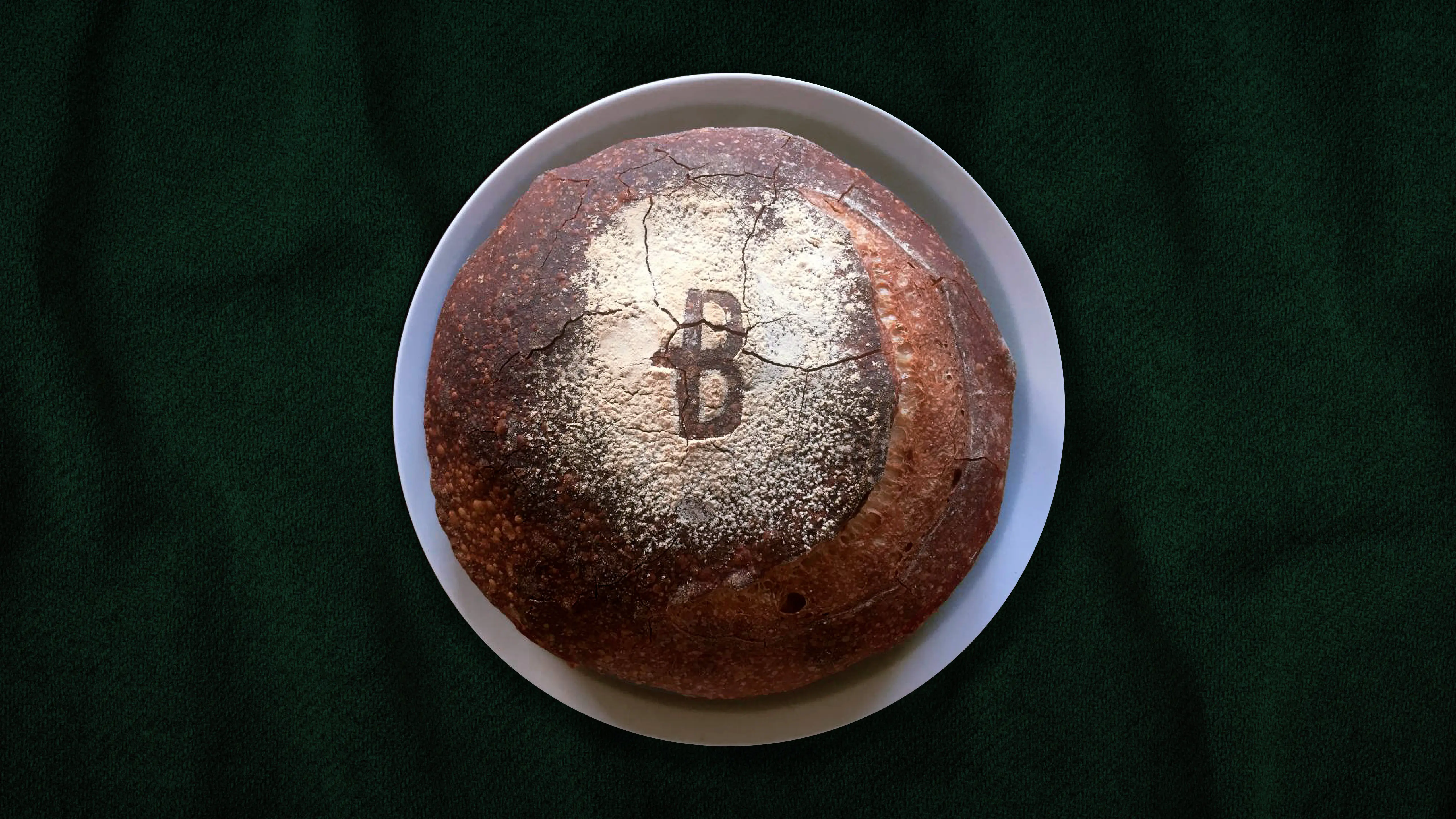
The logotype is meant to represent a stylised Arrosticino, with the cross bars of the letters "B" and "A" elongated and centre-aligned to suggest an ideal skewer. The lock-up then builds on the initial idea, by introducing the use of an icon in the shape of a flame to reinforce the concept of charcoal grilling. The colours palette follows along the initial proposition, by using green and red to suggest connections with the colour of fire and basil leafs. These combined also represent a toned-down and less obvious association with the Italian flag, as used on physical supports such as posters, menu and restaurant furnitures